If you didn’t see the photo of the infamous dress, you probably heard about it. No, not the latest Kim Kardashian waste of time, but a simple dress worn to a February wedding in Scotland. It was a dress with bands of two colors.
The issue isn’t the dress itself; it’s how people perceive the colors of the dress. And across the Internet there is night and day disagreement between the two camps. Some people see the dress as bands of gold and white. Others see it as blue and black.
How is this possible? How can different people see the same object, in this case a color-banded dress, as different colors? The answer comes in the way humans have evolved to see color in a sunlit world.
This is how we see things. Light enters the eye through the lens and different wavelengths correspond in our brain to different colors. Once the light hits the retina in the back of the eye, the brain is signaled to process those colors into an image. But this is where things can get fuzzy. There are two sets of colors — the colors of the object, and the colors of the light illuminating the object. Your brain filters out/throws away the light doing the illuminating to come up with the “real” color of the object.
In this case, the bride’s mother (the dress wearer) sent the photo on her phone to her daughter who showed it to people in the wedding party. They instantly disagreed on its color. The daughter then posted the photo to her Facebook page, and it went viral with two distinctly different perceptions of the dress color.
The differences may be how people are wired. As we’ve evolved, we’ve tailored our vision to see in daylight. But the colors of daylight change with the height of the sun, from pinkish red at dawn to blue-white at noon back to red tones at sunset. Your brain discounts the effect of that light when telling you the actual color of an object you’re viewing. But some people discount the blue side of the spectrum, and in this case see white and gold. Others discount the gold side and see the dress as blue and black.
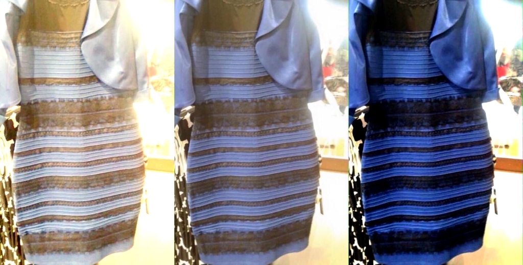
The original image is the one in the middle of the three. On the left, the people at Wired magazine used Photoshop to adjust the white balance to show what those seeing white and gold see. On the right, the white balance is adjusted to show what those seeing blue and black see.
Now, look at the photo in the middle, the original. What do you see?